Creating the New Hay Creek Ranch Logo

Our main logo features Cindy’s horse Charlie, who has unique facial markings.
Written by Jess Lindell, Marketing Manager
What adjectives come to mind when you think of Hay Creek Ranch? What does it feel like to spend all day out on the trail with your horse surrounded by so much natural beauty? What aspects of Hay Creek need to be brought to life in its logo and branding?
These are the questions I asked myself when designing the new look for Hay Creek Ranch. I wanted to capture the “feeling” of being here, incorporate aspects that set Hay Creek apart from other horse camps, and make it easy to understand what Hay Creek is even if you don’t know anything about it.
Step 1: Brainstorming
I started by coming up with a list of words that describe Hay Creek: western, rustic, nature, beauty, horses. I hoped to find a way to make it clear we are in South Dakota, since there are other horse camps around the United States with the same name. I browsed logos of other farms and ranches for inspiration. From there, I just started drawing:

And I kept drawing…

This second page is where a few logos really started to take shape. I figured out the ‘H’ surrounded by a horseshoe-shaped ‘C’ - which is now part of our main logo as well as a stand-alone mini logo.
Step 2: Refine, Digitize, and Collaborate
I settled on four logo options and five color palette options to present to the team:
We ended up using bits and pieces of each option to create our final set of logos.
Step 3: Create a Brand Guide
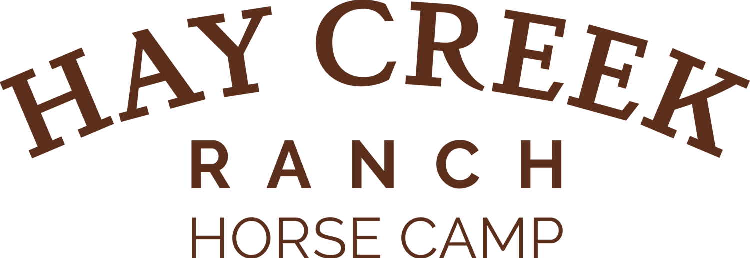
A few different logo options for various applications, six colors and two fonts complete our new brand guide.
